Customize the My Account UI
This section explains how we can customize the theming of My Account application.
Warning
Customizing the theme for My Account may result in the product missing out on updates intended for these components.
Learn more about WSO2 Updates.
Change the default theme to dark mode
A customized version of the default theme in the Semantic UI LESS package has been used to achieve the look and feel of the My Account.
For information on the Semantic UI theming, see Semantic UI documentation.
Before you begin
-
Check out the corresponding identity apps source code from the identity-apps repository. You can check out the
v1.4.28tag sincev1.4.28of identity-apps is used in IS 6.0.0.$ git fetch --all --tags --prune $ git checkout tags/v1.4.28 -b feature-dark-theme-demo -
Navigate to the
modules/theme/src/themesfolder within identity-apps. All the theme global variable overrides can be found in themodules/theme/src/themes/default/globals/site.variablesfile. For the full set of variables, see the original theme variables file.
Follow the steps given below to further customize My Account application.
Step 1: Change the primary color of My Account
In order to change the primary color of the My account application, the variables in site.variables need to be overridden.
-
Add a new color under the site colors and name it. In this example it is named,
facebookBlue./*------------------- Site Colors --------------------*/ @facebookBlue : #2d88ff; -
Now change the primary color variable.
/*------------------- Brand Colors --------------------*/ @primaryColor : @facebookBlue; -
Next, change the page background color and text color. In this example, the background color is changed from white to dark gray and the default text color is changed to a lighter shade. Add a new variable under the brand colors. It is called
globalBackgroundColorin this example./*------------------- Brand Colors --------------------*/ @globalBackgroundColor: #18191a; -
Override the
@pageBackgroundvariable./*------------------- Page --------------------*/ @pageBackground : @globalBackgroundColor; @textColor : #e4e6eb; -
Build the theme module by running the following command and check the results reflected on the dev server.
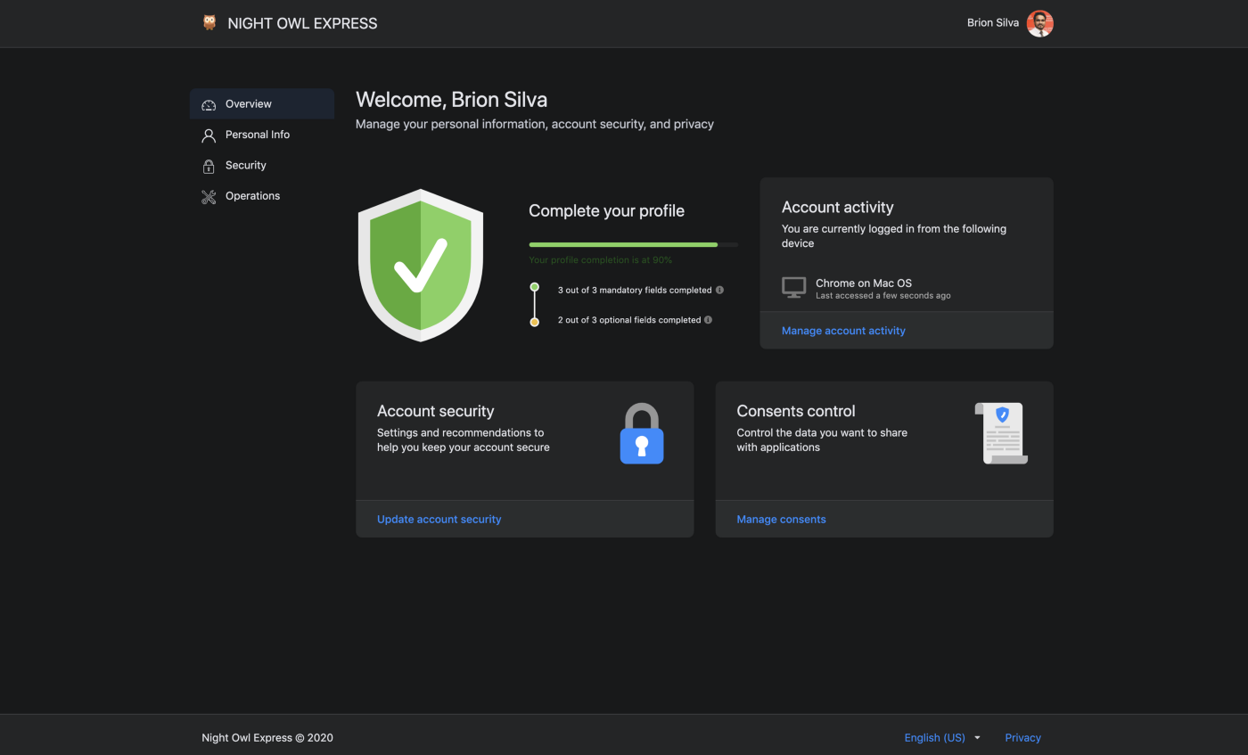
The response should be similar to the screenshot given below.# from inside `modules/theme` $ npm run build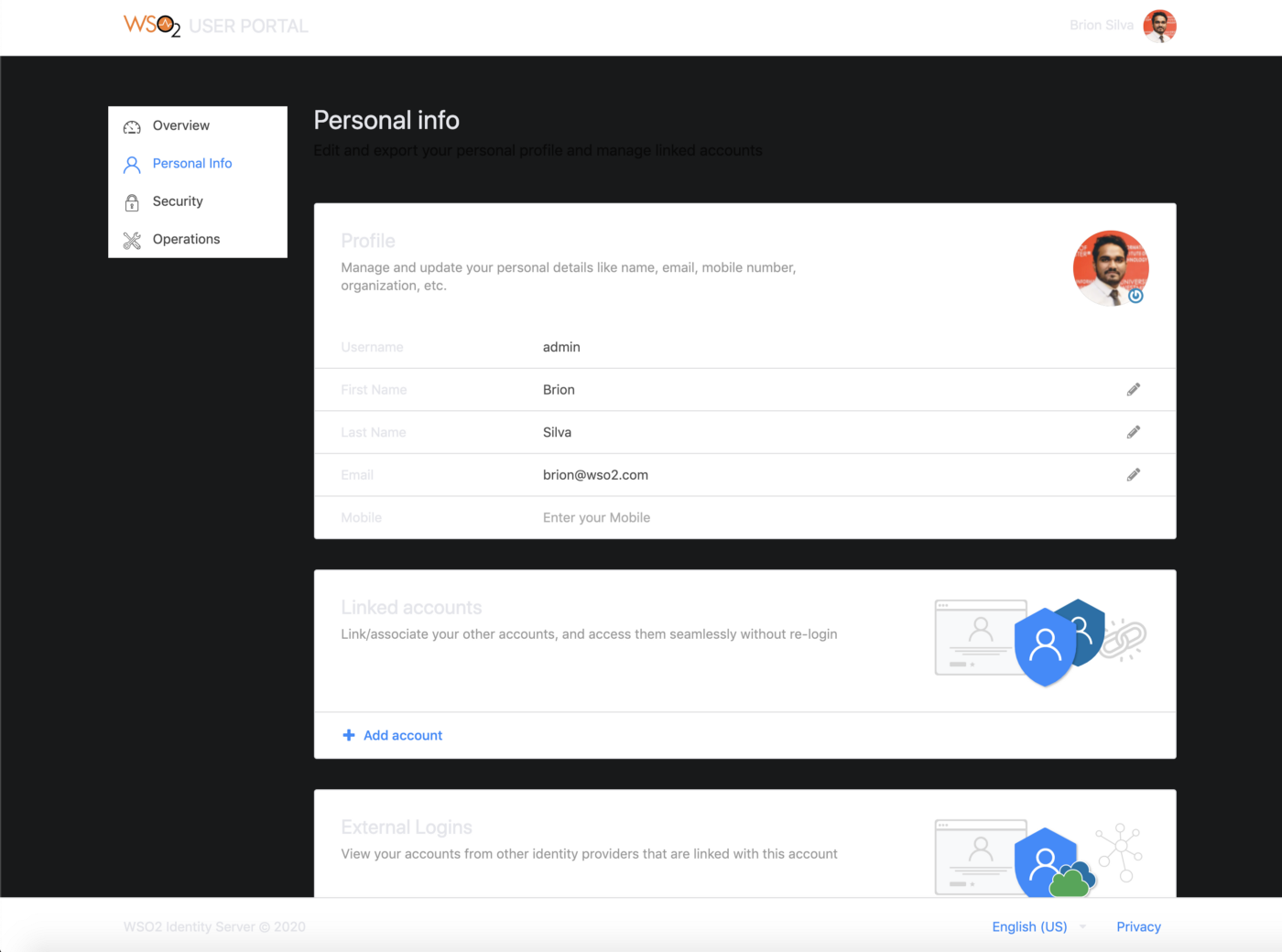
As seen in the image above, the background color of the header, footer, side navigation, and content cards can be changed.
-
In order to change the header and footer background colors, add a new variable to the
modules/theme/src/themes/default/globals/site.variablesfile and give it a value as shown below. This variable is namedglobalForegroundColorin this example./*------------------- Brand Colors --------------------*/ @globalForegroundColor: #1d2630; -
Add the color defined in the step above (
globalForegroundColor) to the Menu, App Header, and App Footer sections in themodules/theme/src/themes/default/collections/menu.variablesfile as shown below./******************************* Menu *******************************/ @background: @globalForegroundColor;/*------------------- App Header --------------------*/ @appHeaderBackground: @globalForegroundColor;/*------------------- App Footer --------------------*/ @appFooterBackground: @globalForegroundColor; -
Change the side panel background in the
modules/theme/src/themes/default/collections/menu.overridesfile..ui.vertical.menu { &.side-panel { background: @globalBackgroundColor; // Other styles } } -
Modify the content card background color in the
modules/theme/src/themes/default/views/card.variablesfile.@background: @globalForegroundColor;
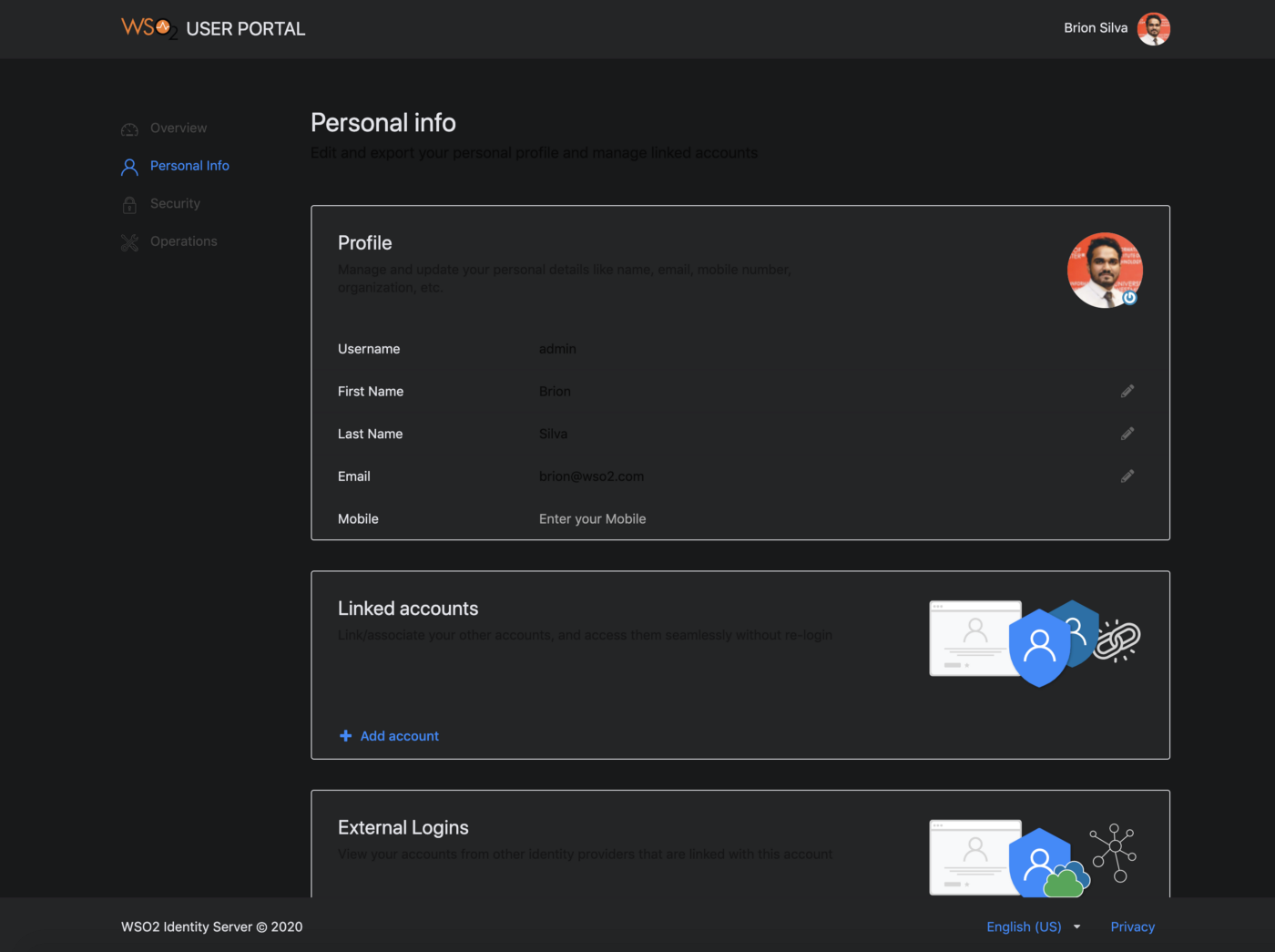
The status can be checked by rebuilding the theme module. The changes should be reflected on the running dev server in no time. A sample screen of the new theme is shown below.
Step 2: Change the branding
Now that the styling is complete, the following steps explain how the product branding can be changed.
Change the product logo
Follow below instructions to override the existing WSO2 IS logo using CSS.
-
Download an icon from any of the providers such as Flaticon.com. In this example,
owl.svgwas the downloaded icon. Now add it to themodules/theme/src/themes/default/assets/imagesfolder. -
Open the
modules/theme/src/theme-core/definitions/globals/product.lessfile and replace the existing styles in the.product-logoclass with the following..product-title { .product-logo { width: 25px; height: 25px; vertical-align: text-top; margin-right: 5px; background: url(assets/images/owl.svg) no-repeat; background-size: auto; svg { display: none; } } // Other styles }
Step 3: Deploy changes in the web app
The final step of the process is the deployment. Follow the sequence of steps listed below to deploy the changes performed in the previous steps.
-
Build the theme module.
# from inside modules/theme $ npm run build -
Copy the
defaulttheme folder available insidemodules/theme/dist/lib/themes/directory into the<IS_HOME>/repository/deployment/server/webapps/myaccount/libs/themes/folder.Warning
Make sure that you keep a backup of the original theme folder.
-
Open the
home.jspfile available in the<IS_HOME>/repository/deployment/server/webapps/myaccount/directory and search for the HTML link tag referencing the minified theme file. The filename will be in the format oftheme.<hash>.min.css. Find the filename of the newly build minified theme file and replace it in the HTML link tag.<link href="/myaccount/libs/themes/default/theme.<hash>.min.css" rel="stylesheet" type="text/css"/>
The final theme should look similar to following.